Week 11: Storytelling with Data

Shifting Focus

  • Up to now, much of the work has been about analysis
  • From now on, we will spend more time on communication
  • A technically correct result is not enough if nobody can quickly understand it
  • The value of analysis depends on whether it informs a decision

Big Picture: Course Logic

%%{init: {"themeVariables": {"fontSize": "24px"}}}%%
flowchart LR
  G[Goals] ==> P[Problem]
  P ==> Q[Question]
  Q ==> Da[Data]
  Da ==> M[Model]
  M ==> R[Result]
  R ==> V[Visual Story]
  V ==> D[Decision]

  style V fill:#FFD966,stroke:#333,stroke-width:3px,color:#000

Good Visuals

Good visuals are not just about making charts.

They are about helping someone understand what matters and what to do next.

Why Bad Graphs Are Everywhere

  • Graphs/charts are easy to create
  • Good graphs are much harder to design
  • Most people are not naturally trained to tell stories with numbers
  • Software can generate charts quickly, but not always well
  • Many graphs show data without communicating a clear message

Showing Data vs. Telling a Story
Adding Value

Showing data

  • report the numbers
  • present the default chart
  • treat every detail as equally important
  • leave the audience to find the point

Telling a story

  • start from the decision or question
  • choose a visual that fits the comparison
  • reduce clutter
  • focus attention
  • make the takeaway visible

A technically correct chart still fails if the audience cannot quickly tell:

A. which software created it

B. what the main takeaway is

C. whether the data are quantitative

D. how long it took to build

Activity: Graph Diagnosis

Graph Diagnosis: Small Groups

Discuss

  • What is wrong with this graph?
  • What do you think the intended message is?
  • Why does the graph fail to communicate it?

Be ready to report one redesign move.

Graph 1

  • What is wrong with this graph?
  • What do you think the intended message is?
  • Why does the graph fail to communicate it?

Graph 2

  • What is wrong with this graph?
  • What do you think the intended message is?
  • Why does the graph fail to communicate it?

Graph 3

  • What is wrong with this graph?
  • What do you think the intended message is?
  • Why does the graph fail to communicate it?

Graph 4

  • What is wrong with this graph?
  • What do you think the intended message is?
  • Why does the graph fail to communicate it?

Graph 5

  • What is wrong with this graph?
  • What do you think the intended message is?
  • Why does the graph fail to communicate it?

Graph 6

  • What is wrong with this graph?
  • What do you think the intended message is?
  • Why does the graph fail to communicate it?

Debrief: What Problems Recur?

  • clutter competes with the message
  • poor chart choice makes comparison difficult
  • color is used without purpose
  • legends create unnecessary eye travel
  • context is missing: compared to what, and why does it matter?
  • there is no clear takeaway

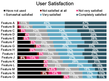
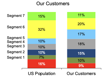
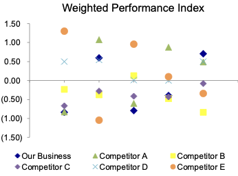
The story is not automatically in the data.

The analyst has to surface it.

Activity:
Before vs. After

Before vs. After

  • First we will walk through one example together
  • Then you will do a second example in pairs before seeing the redesign
  • Focus on what changed and why it improves communication

Full-Class Walkthrough: Before

What do you notice first?

What decision, if any, would this chart support?

Full-Class Walkthrough: After

Decision implication:

Add staffing or redesign queue management for phone support.

What Changed?

  • Context was added with a target
  • The categories were ordered for the question
  • One bar was highlighted
  • Labels were moved onto the chart
  • The title states the takeaway

Pair Exercise

  • Work with a partner
  • First interpret the “before”
  • Then decide what you would change before seeing the redesign
  • Be ready to explain why your changes would help a decision-maker

Pair Exercise: Before

What pattern do you think matters most?

What would you change first?

Pair Exercise: After

Decision implication:

Lean further into text outreach and diagnose why direct mail lost effectiveness.

Pair Debrief

  • The message was change, not just level
  • The chart type now matches the comparison
  • Color is used to direct attention
  • The title translates evidence into a management takeaway

Reverse Engineering

Reverse Engineer an Effective Visual

  • What is the main takeaway?
  • What design choices make that takeaway easy to see?
  • Which parts of the chart focus your attention?
  • How does the wording help tell the story?

Checklist

  1. Understand the context and decision
  2. Choose an apprpriate visual
  3. Eliminate clutter
  4. Focus attention where you want it
  5. Make the takeaway explicit

Final Takeaways

  • Analysis is not finished when you get the results
  • A good visual helps the audience see what matters quickly
  • Good visuals support decisions, not just description
  • The rest of this course unit is about moving from technically correct output to effective communication