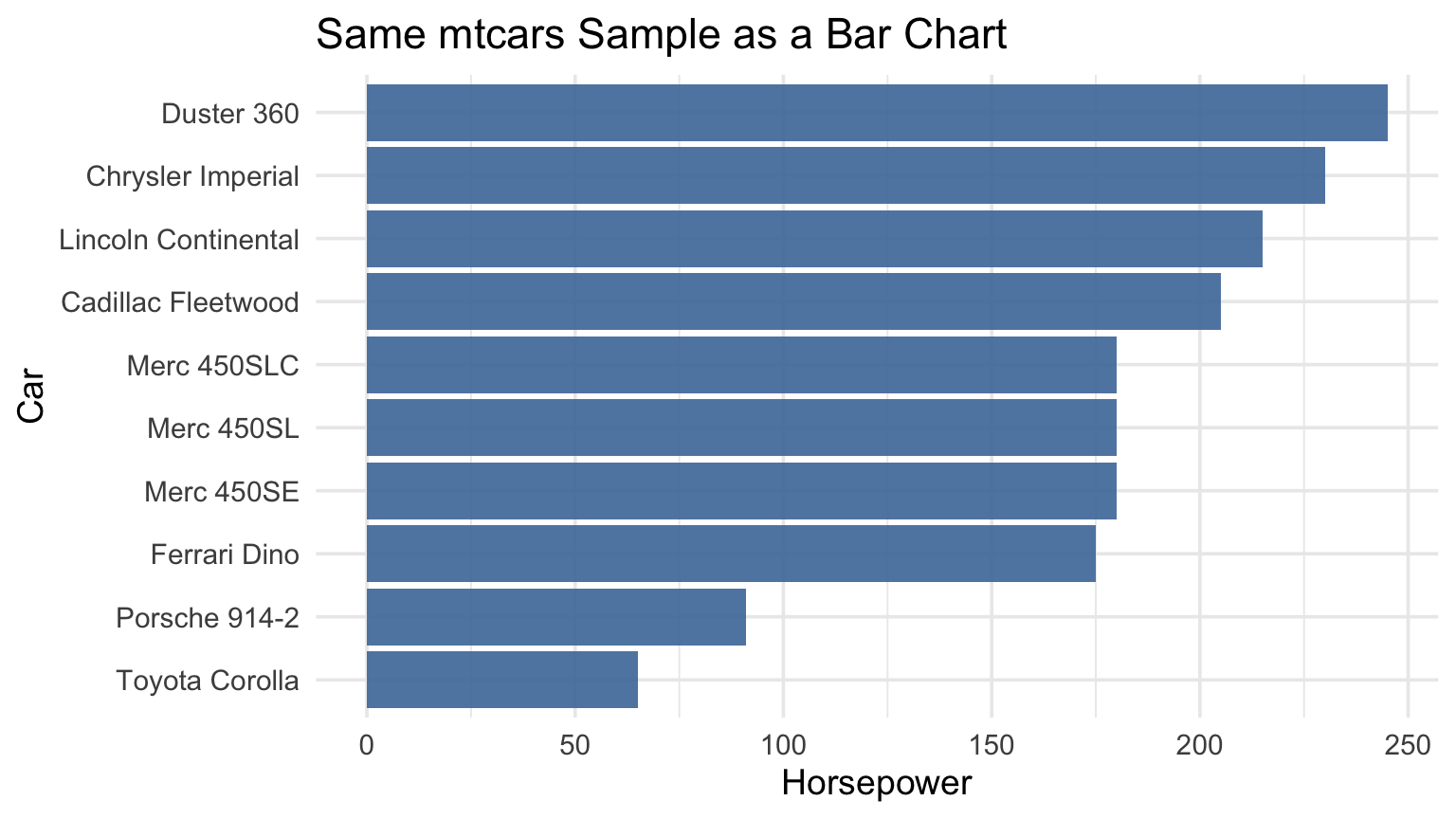
Week 12: Choosing Effective Visuals

According to the chapter, why should you generally avoid tables in live presentations?

A. They are visually unattractive

B. The audience will read them instead of listening

C. They are too difficult to create

D. They cannot show enough data

What is a key requirement when using time on the x-axis in a line graph?

A. Values must start at zero

B. Data must be categorical

C. There must be at least two lines

D. Time intervals must be consistent

According to the chapter, what is the main reason pie charts are discouraged?

A. People cannot accurately compare angles and areas

B. They take up too much space

C. They cannot display more than a few categories

D. They require too much data preparation

Key Message

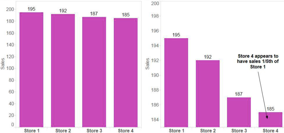
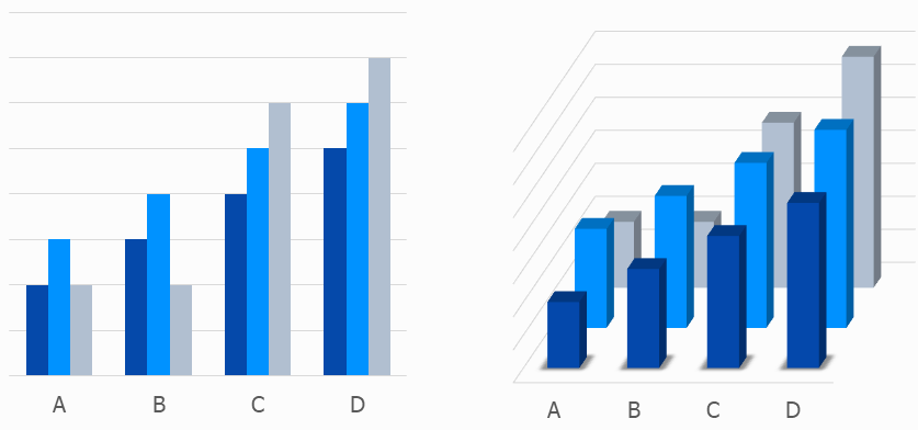
Choose the visual that makes your message easiest to understand.

Big Idea in Practice

  • Start with the audience
  • Clarify the decision or purpose
  • Choose the simplest visual that supports that purpose
  • Remove anything that does not help comprehension

Choose the visual

Instructions

  • Groups of 4
  • For each of scenario 4 scenarios, sketch the best visual
  • Come to the front and share
  • Vote on each scenario
  • Winner gets the peeps

Scenarios (4)

  1. GDP for three countries from 2000 to 2025 (5 year intervals)
  2. Household income vs. household spending for 500 households
  3. Company market share across five brands (20%, 35%, 15%, 25%, 5%)
  4. Customer satisfaction for 3 products in 2026 (90%, 85%, 92%) and 2027 (88%, 87%, 91%)

Be ready to share your choices and reasoning.

Decision Framework

Use this quick guide when selecting a visual:

Situation Best default
One or two numbers Simple text
Need precise lookup Table
Relationship Scatterplot
Time Line graph
Categories Bar chart

Principle 1: Simple Text Can Be Best

  • If you have only one or two key numbers, write them directly
  • A chart can add cognitive load when the message is small
  • Lead with the number and context

Table

car hp
7 Duster 360 245
12 Merc 450SE 180
13 Merc 450SL 180
14 Merc 450SLC 180
15 Cadillac Fleetwood 205
16 Lincoln Continental 215
17 Chrysler Imperial 230
20 Toyota Corolla 65
27 Porsche 914-2 91
30 Ferrari Dino 175

Same Data as a Visual

Principle 2: Tables vs. Graphs

Tables = read (slow)

  • Exact values
  • Lookup tasks
  • Dense detail

Graphs = see (fast)

  • Patterns
  • Comparisons
  • Trends and outliers

Principle 3: Match Type to Question

If the question is… Then use…
Are these two variables associated? Scatterplot
How did this change over time? Line graph
Which category is larger/smaller? Bar chart

Common Mistakes

Mistake 1: Bar Charts That Do Not Start at Zero

  • Truncated axes exaggerate differences
  • For bars, baseline matters for fair comparison

Mistake 2: Pie Charts

  • Hard to compare angles and similar slices
  • Labels and legends increase eye travel
  • Prefer bars for most category comparisons

Mistake 3: 3D Effects

  • 3D distorts lengths and areas
  • Perspective hides true values
  • Decoration reduces clarity

Mistake? 4: Secondary Axes1

  • Two scales can imply misleading relationships
  • Use separate charts when in doubt

Dual Axis Alternatives

Two separate charts

Index

Another Example

Other chart types

  • slopegraphs
  • sankey diagrams
  • treemaps
  • heatmaps

Slopegraph

Sankey

https://sankeyflowstudio.com/

Treemap

https://veridion.com/us-federal-contractors/

Heatmap

Data is…

Assortment

Press

Mary

Names

Kyoto Cherry Blossom (Sakura)

Final Takeaway

The best visual is the one your audience understands fastest.