Week 14: Refining Data Visuals
From Making to Refining Charts
- Previously, the question was: what visual should I use?
- Now, the question is: what needs to change so the message is obvious?
- A chart is not finished when it is accurate
- It is finished when a decision-maker can intepret and comprehend it
Clutter Is More Than Ugly
- Every visual element uses audience attention
- Signal helps answer the question
- Noise slows the audience down without improving understanding
- If a border, label, marker, or color does not earn its space, question it
A visual can be technically correct and still be harder to read than it needs to be.
Applied Example 1
Audience: board of directors
Decision: which region to conduct a pricing review
Goal: communicate that the West division has the lowest operating margin
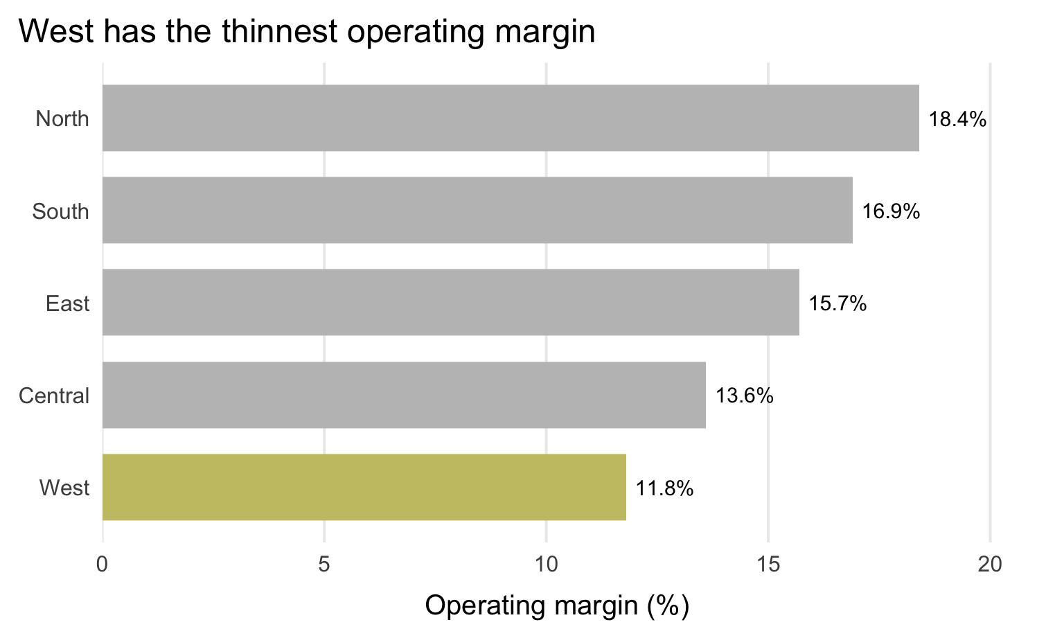
Applied Example 1: Before
What is your eye drawn to first?
What is making this slower to read?
![]()
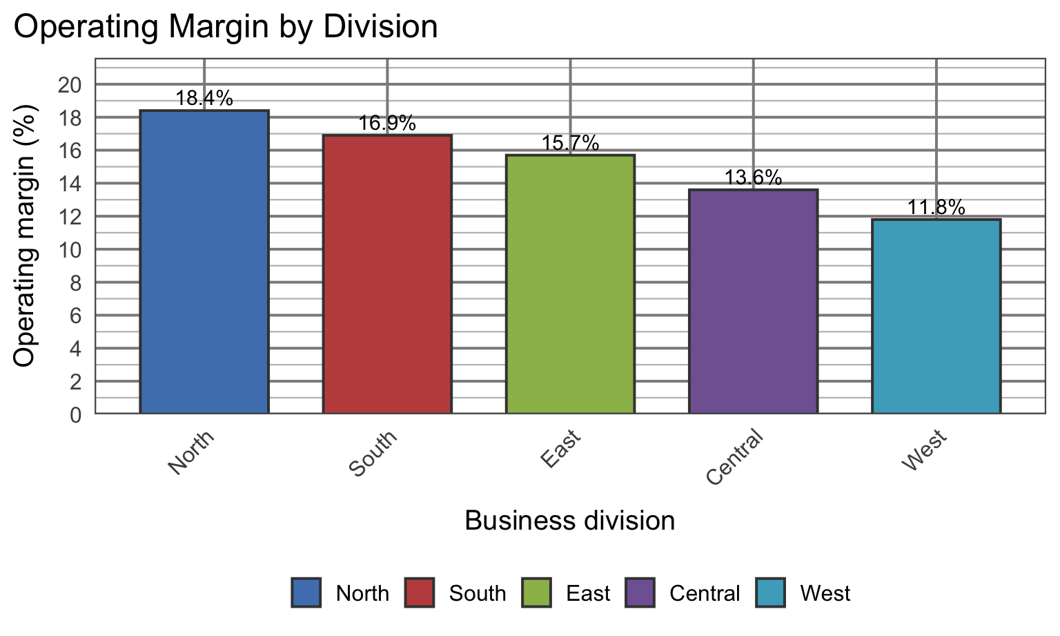
Applied Example 1: After
Decision implication:
Focus the next pricing review on West, the lowest-margin division.
![]()
Common Clutter Reduction Moves
- Remove chart border
- Remove gridlines
- Remove data markers
- Clean up axis labels
- Label data directly
- Leverage consistent color
Focus Attention on Purpose
Fast signals: color, size, position (preattentive attributes)
Use them to
- show the audience where to look first
- push nonessential elements into the background
- create a visual hierarchy
If everything is bold, colorful, and large, nothing stands out.
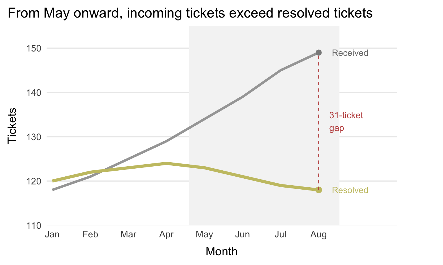
Applied Example 2
Audience: IT director
Decision: Increase capacity
Goal: communicate that the backlog of support tickets is growing
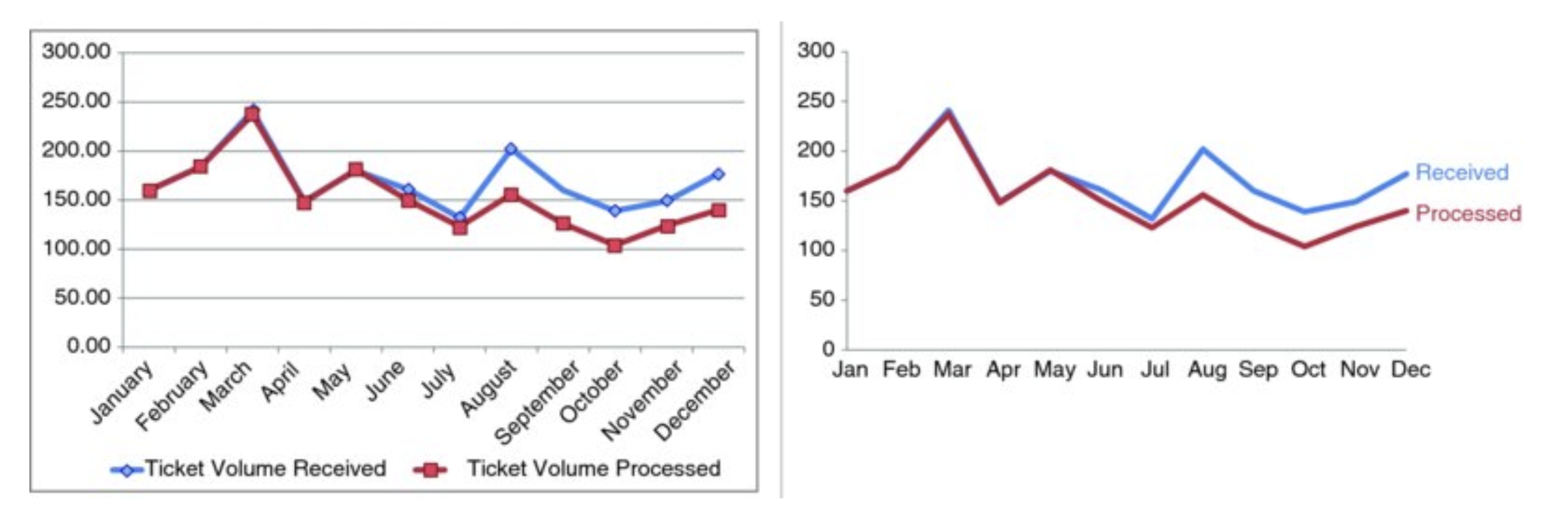
Applied Example 2: Before
What is the main message of this chart?
Is it visible quickly?
![]()
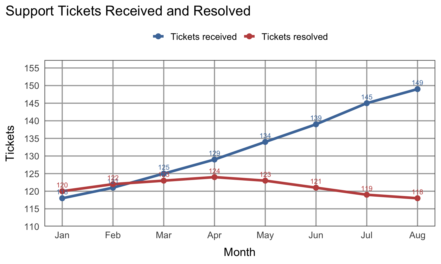
Applied Example 2: After
Decision implication:
Backlog is widening, so capacity needs to increase or demand must be managed.
![]()
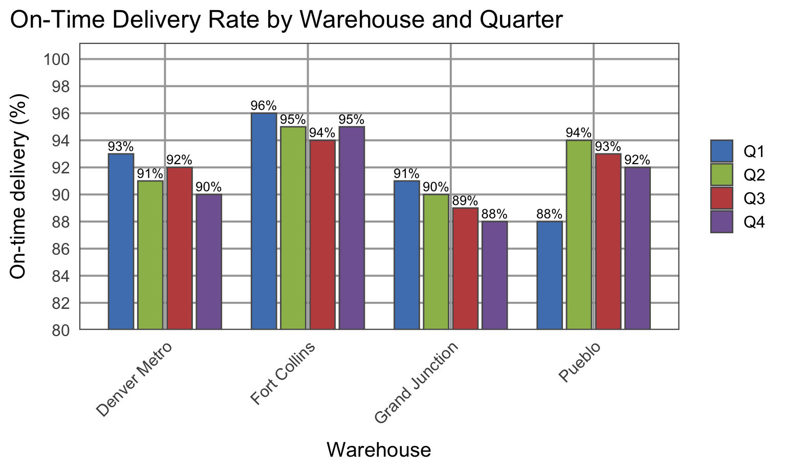
Activity: Visual Redesign
Activity Visual A
What would you remove, mute, highlight, and rewrite?
![]()
Activity Visual B
What would you remove, mute, highlight, and rewrite?
![]()
Debrief
- What did your group remove first?
- What did you decide to mute?
- What did you choose to highlight?
- What takeaway should the audience see before anything else?
Reminder: refining a visual is not cosmetic. It changes how quickly and accurately someone understands the analysis.
Final Takeaways
- Remove clutter
- Create order
- Guide attention
- Refine visuals with the audience and decision in mind
Refining a chart is part of analysis, not decoration.
Lab this week
Lab will focus on how to redesign visuals
Have a draft of your project visual for class. We will workshop them in small groups and give feedback to each other.
Project checkin
- Think carefully about your audience and decision.
- Does your analysis answer a question that matters to a real decision-maker?
- What is the one key message you want to communicate with your visual?